Pluto Pay
-

Role
UX Designer & Researcher
-

Duration
7 months
-

Tools
Figma, Figjam, Survey Monkey, Optimal Workshop & Microsoft Powerpoint
Summary
-
About
Pluto Pay is an App that specializes in Digital payments and Financial Services. This App will allow users to transfer money safely and securely along with providing a digital wallet feature that can be used at Shopping Malls, Grocery Stores, Pharmacies, Restaurants, etc.

-
Problem Statement
A lot of users around the world want to find a simple solution to send money internationally and nationally without any kind of hassles including transfer fees, less time, and providing them with safety and security with sending money. They also want to be able to make payments in grocery stores, malls, restaurants, etc., through their phone. We will know this to be true when users have the potential platform to do so.

-
Target Audience
The Target audience is any individual around the world however, the minimum age group for this app is recommended for 16-18, mid-high school students who want to save money for their goals. Other age groups can refer to mid-adults (18-40) during times when they have primary expenses including college, buying a car, purchasing a house, paying rent or mortgage bills, groceries, and shopping, and transferring money. Ages 65 and older can also be an option for those who still want to use their phone to send money.

Design Process
Discover
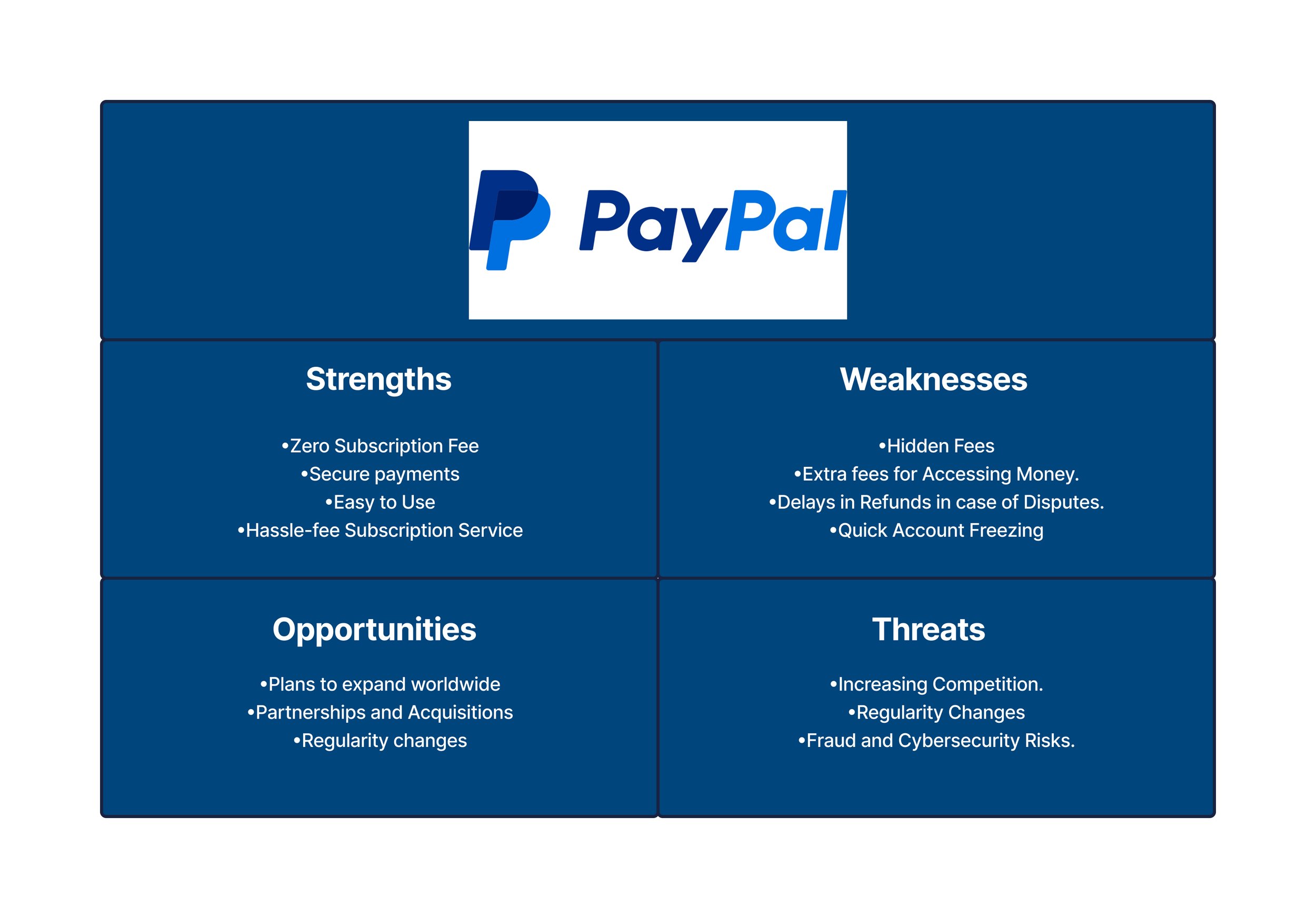
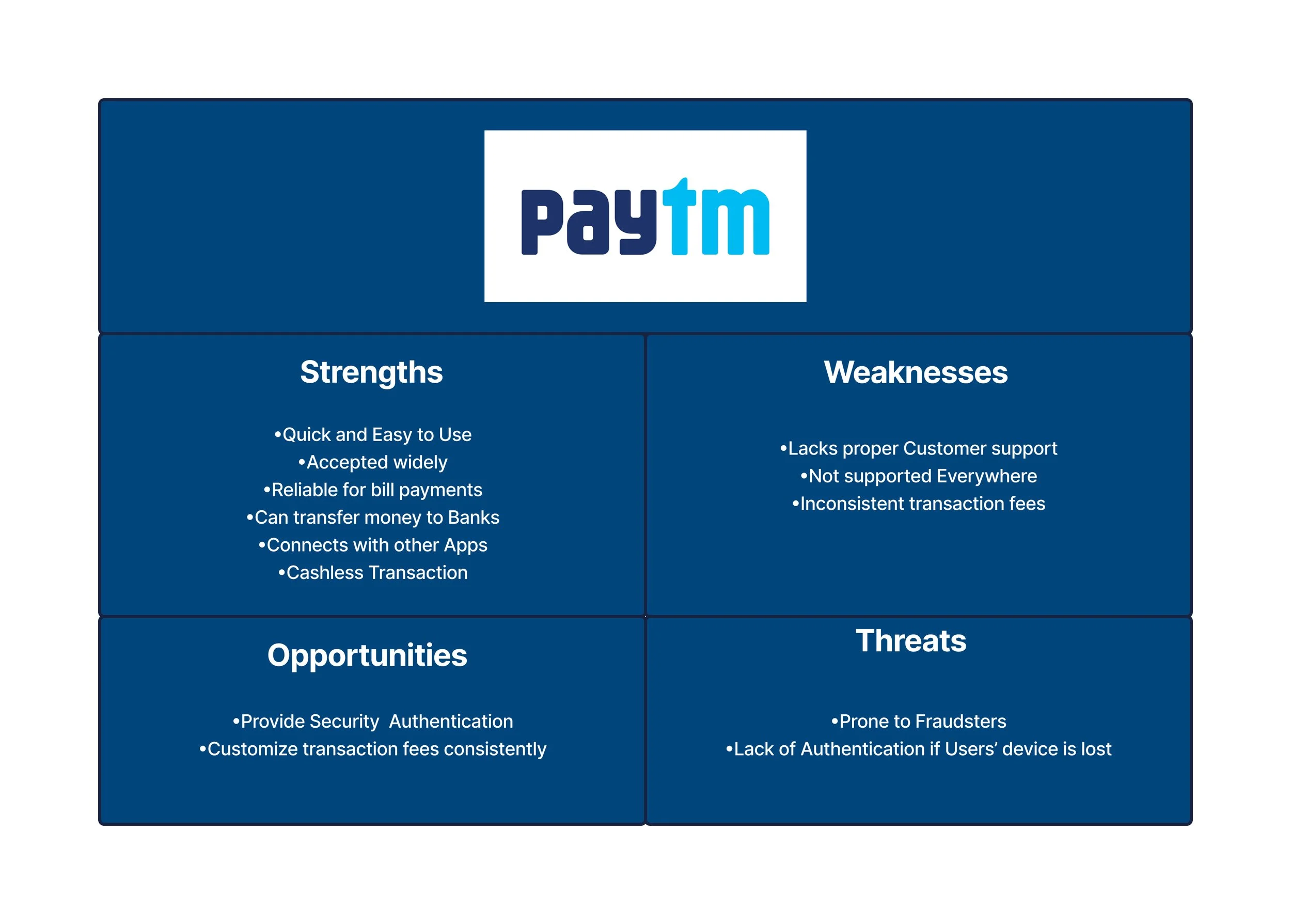
During the project's initial phase, I started with a discovery process, starting off with a competitive market analysis aiming to identify competitors within the financial services sector. Subsequently, I considered the strengths and weaknesses of their organizations and services along with other factors on their business approach. Furthermore, I gathered valuable insights directly from users to inform our strategic direction with User Surveys and User Interviews.
Competitive SWOT Analysis
-

PayPal
an online payment system that allows you to send and receive money around the world. You can link your bank account, credit card, or debit card. You can also have a balance in your PayPal account.
-

Paytm
An Indian multinational financial technology company, that specializes in digital payments and financial services, based in Noida, India.
-

CashApp
A mobile payment service available in the United States and the United Kingdom that allows users to transfer money to one another using a mobile phone app
User Surveys
-

Participant Count
17
-

Question Count
8


User Interviews
-

Participant count
4
-

Age Range
25-60
-

Conducted on
October 15th-October 21st
-

Duration
20-35 minutes per participant
2. Define
The next phase was to define the problem statement, current processes, pain points and possible opportunities to empathize with the users.
Affinity Mapping
Based on overall User Research Findings
Personas
The personas were taken from User Research Data to define each individual problem statement and the goals when it comes to using financial services.
Journey Maps
I also created Journey maps to demonstrate Users' current processes and Pain points in the journey of using financial services.
User Stories
-
Login/Signup
1. As a New User, I want to be able to set up a password and if possible a Face Authentication process, So I can trust that my account will be secure and protected
2. As an Existing User, I want to be able to use the ‘face authentication’ feature to log into my account, so It will not be risky when or if I lose my phone. -
Onboarding
1. As a new user, I want clear guidance on how to use the app, so I can learn how to make my transfers and money safe and prevent it from falling into the wrong hands.
2. As a New User, I want to be able to link my account information from the beginning of on boarding, so I will not have to go through the hassle of entering my details numerous times when sending money or making payments. -
Sending money
As a user, I want to complete the details of the beneficiary by entering the account number and bank before, so I can confirm if I am sending money to the right person.
As an existing User, I want to save my beneficiary details, so I can have the ability to send money to them whenever needed.
As an Existing User, I want to be able to send my parents money back in India through my phone, so I do not need to go through any processes of visiting local stores, paying any hidden fees or not being eligible.
-
Navigation
As a new user, I want the navigation labels to be clear, so I will be able to navigate through the app and get my tasks done.
-
Making payments
As a new user, I want a clear view of how to make payments at stores or malls, so it will be easier for me to make the payments.
As an Existing User, I want to be able to pay at the store, so I do not need to take out my wallet every time and dig for my cards or cash.
3. Ideate
Next, I formulated solutions and ideas out of which I incorporated one of the user centered Design principals which is card sorting and it helped me in constructing User flows and the Sitemap. Then I translated the User flows and Sitemaps into Wireframes
Card Sorting
-

Participant Count
8
-

Duration per participant
5 minutes
-

Location
Remote
-

Topic count
8
-

Card Count
30
Insights from Card Sorting
•Most of the participants recommended keeping the QR Code on the E-Wallet topic.
•There were a couple of them who recommended considering rent as a private beneficiary as sometimes they used to pay private landlords.
•There were some mixed debates on how to implement users’ debit/credit cards whether on the E-wallet or simply on their profile page.
•All participants agreed on the idea of implementing bill payments and loved the idea of considering a bill payment feature and page.
User Flows
After cart sorting, I took the data from the insights and started planning out some basic User Flows to demonstrate each task users need to do and what goals they want to accomplish out of these tasks.
Information Architecture
The information architecture was taken from Card sort results to construct the structure of Pluto Pay.
Wireframes
4. Test & Validate
After Creating the wireframes, it was time to test the prototypes to analyze if users were able to complete the primary functions of the app and reiterate according to any frustrations or errors users faced when interacting with the prototype.
Usability Testing
-

Participant count
5
-

Age Range
25-60
-

Conducted on
January 1st-January 3rd 2024
-

Duration
15-20 minutes per participant
-

Test Format
Moderated In person
Tasks & Scenarios
-
Scenario 1: A user is new to Pluto Pay
Task 1: Create an account
Task 2: Experience Onboarding
-
Scenario 2: You would like to use the App as a wallet.
Task 1: Add a new card
Task 2: Open Card
-
Scenario 3: You would like to send money to someone.
Task 1: Add a new Payee
Task 2: Transfer Money to Payee
Results (Affinity Mapping)
Overall Observations
-
1. Onboarding:
40% of the participants skipped the on boarding process
-
2. Technology:
This was tested on my laptop and 60% of the users did not engage in the feel of using a mobile app through phone so it is important to try to open the Figma files through my phone next time.
-
3. Focus:
Even though note taking is essential during usability testing, eye contact on the participants is equally important.
-
4. New Beneficiary form:
60% of the participants did not understand why there was no name input field as they mentioned they play a key role in implementing a customer’s banking details.
Low fidelity to High Fidelity
Styleguide
A/B Testing
Transactions aka Homepage
Option 1
Option 2
1. 5 out of 7 participants mentioned that the design on the navigation bar for option 1 looked amazing, however they said that the navigation bar in Option 2 is easy to read.
2.According the analyses that outlines the line by line transactions, 6 out of 7 participants found Option 2 more convenient as they said the design will give them an option to view the transaction.
Wallet
Option 1
Option 2
1.All the Participants admired the design in option 1 as they mentioned that it gives them a look and feel of carrying cards in their phones.
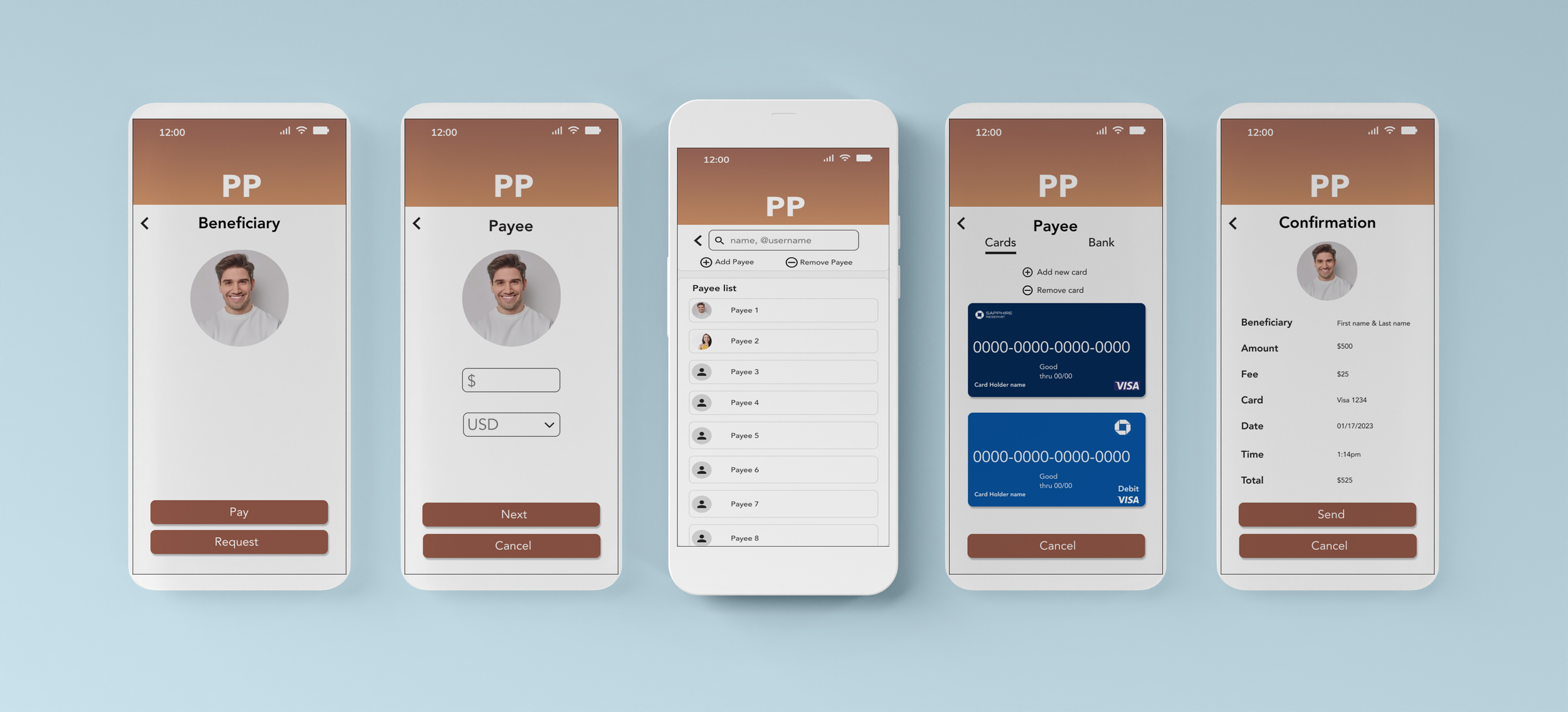
Payee Screen
Option 1
Option 2
1.All the Participants preferred Option 2 over Option 1 as they mentioned that the box surrounding the name of each beneficiary will be easier to select a certain beneficiary without any mistake.
2. In addition to this, a lot of others said that the term 'beneficiary was too complex and recommended to simplify it to 'Payee'.
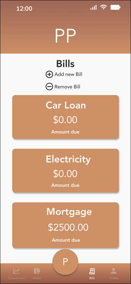
Bill Screen
Option 1
Option 2
1.All the participants admired option 1 as they said that they love the idea of providing images that represent each bill making the app fun to use.
2. The use of Color and styling was also validated through considering the Accessibility guidelines.
Final Mockups
Final Prototype
Outcome & Learning
This was a fun project and an awesome experience to create a full case study from beginning to end, especially since it aligns with my experience working with Financial Services. I feel like I achieved a lot working on this project and I learned a lot from the design insights to create a more intuitive experience for users who weren’t aware of it but had ingrained actions. I also understood that users were hesitant with personal information and very particular with privacy and security especially when traveling to have their information secure as well as payments. From my experience coming from India, I also understood that immigrants living in US want to send money for various reasons and they want a user friendly and intuitive experience. I look forward working on more projects and expanding my UX Designs moving forward!


